Humble Growth
In a category that invites big egos, a brand stands out by checking theirs at the door. The founders of Humble Growth are some of the biggest successes in their fields: creators, movers and shakers, history makers. They’ve earned every right to have the biggest heads in business, but as their name signifies, their approach is to keep their heads down and roll up their sleeves.

Recognition without boastfulness
Their desire for a strong identity within the saturated capital investments industry was a conundrum: they wanted to be recognized as the successes they are, but they absolutely did not want to be boastful about it.
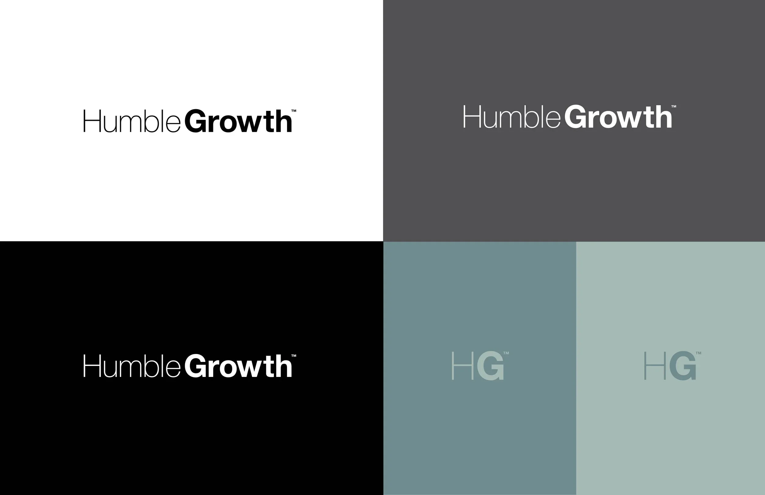
Stature without arrogance
Humble Growth’s shared respect for the hard work and hard lessons that got them where they are brought the team together. They weren’t looking to be just another bank for startups, they wanted to lend their wisdom and insights to other hard-working, right-minded entrepreneurs. Stature without arrogance: that was our brief.
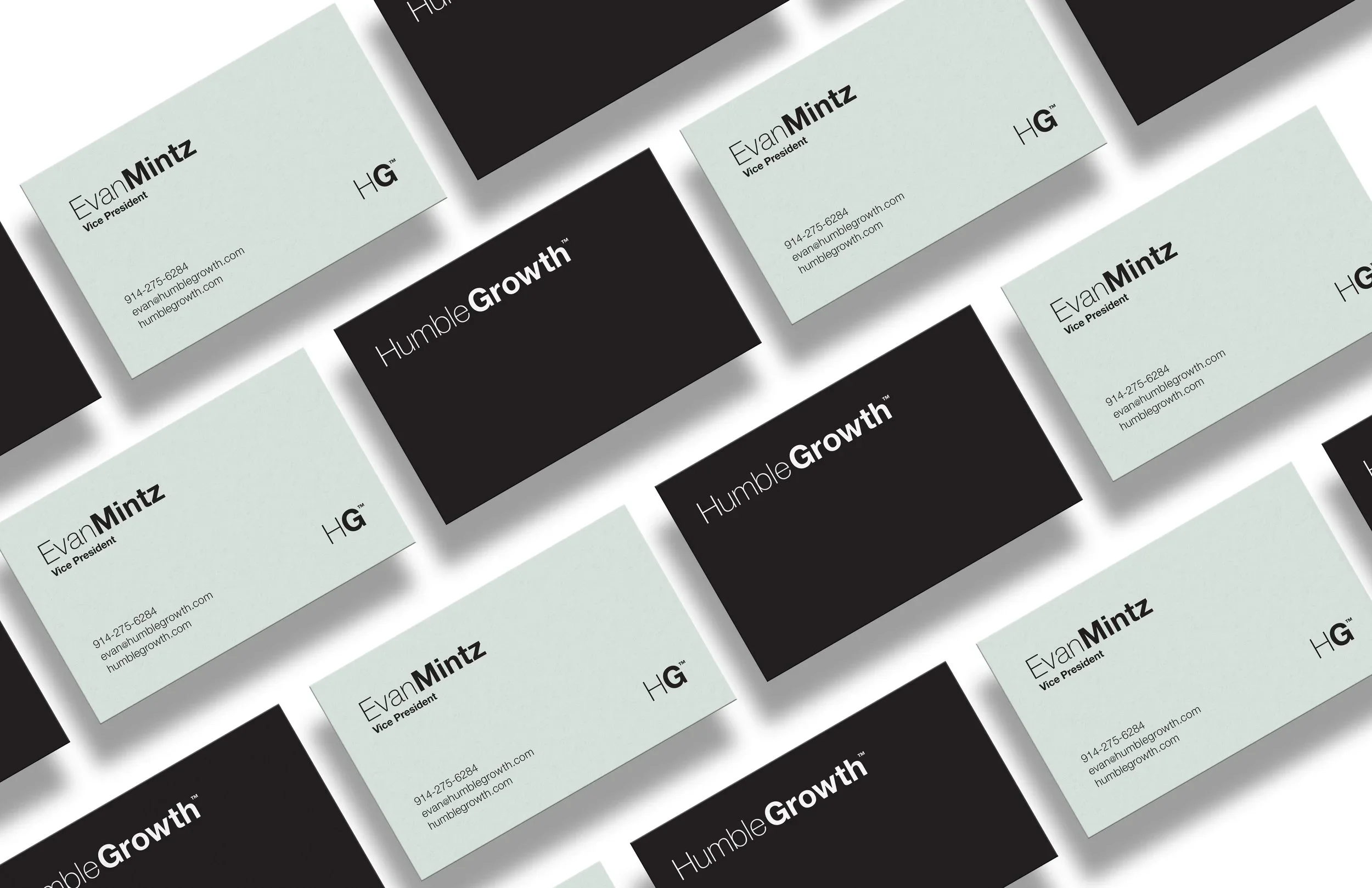
Creative at work
We took their name literally as our guide for their identity and for the story and design of their website. Simple language, subtle movements, type that grows. The brand landscape is monotone and minimal, sharply sophisticated without being intimidating—a direct reflection of a group of people who have the confidence not to be jerks.